Published September 29, 2009 Follow @NRLTweet
Where should your team be in our Top 10? Let us know in the comment section below the article.
 The Gold Coast-Tweed Giants entered the NSWRL in 1988 alongside the Newcastle Knights and Brisbane Broncos and unveiled this beauty with a grey and white jersey that just screamed style.
About the only question mark is why is the Giant sporting a crop top?
 The Canberra Raiders and the logo that represented them were a force from the late 1980s all the way through the 1990s.
 The Manly-Warringah Sea Eagles have always been a team people didn't like.
Going more '1990s cartoon like' was a mistake in the mid-1990s (although it wasn't until 1999 that the team began to really struggle on the field as a result)... and the current logo is trying to replicate the quality of the past but doesn't quite achieve it.
 The merger between the Illawarra Steelers and the St.George Dragons remains to this day a tragedy... because the 1999 joint venture meant that the Steelers 1998 version of their logo only saw the light of day for one season.
 The Chocolate Soldiers was one of the great nicknames in sport before the Penrith Panthers upgraded their jersey and tinkered with their logo in the early 1990s.
Truth be told the chocolate is more of a defining feature rather than a good looking one, but the way it works in the logo makes it a standout symbol for the Penrith football club.

 The St.George Dragons hold a special place in the history of Rugby League with their incredible eleven straight titles from 1956-1966, a feat that may never be matched.
The shield suits the image and the block letters of ST.GEORGE looks at home atop the shield.
It is a classic looking logo that is deserving of 4th place in this list.
========================================
At Number THREE...
 The Balmain Tigers were the team that played with a ferociousness in the mid to late 1980s that suited their logo down the ground.
The logo represented the warrior mindset of all the great players of that Tigers era - willing to scrap and claw their way to victory and sometimes just rip you apart.
 One of the key decisions the North Sydney Bears need to make before they try and return to the NRL at any stage in the future, is to choose to go back to the logo that was synonymous with their rise back to competitiveness in the 1990s.


 The Western Suburbs Magpies were never a 'sexy' club and despite a surge towards the top of the league in the early 1990s under Warren Ryan and his Canterbury contingent, they eventually fell into obscurity and mediocrity and into a merger with the Balmain Tigers by 2000.
The Magpie still has a home on the shoulders of the Wests Tigers jersey but the days of the Black Jersey with the double White V (or the reverse White Jersey with double Black V) are fondly remembered.
 RABBITOHS
 EELS
EELS
========================================
WHAT IS YOUR CHOICE AS THE BEST LOGO IN RUGBY LEAGUE HISTORY?
It is 2009 NRL Grand Final Week, so to celebrate here on www.wdnicolson.com we are paying homage to the great logos of Rugby League's past.
Full disclosure, the 1980s and 1990s have a huge influence on our selections as that's when Rugby League injected into our veins.
You might not agree with the order we have come up with - but as you scroll down you will find it hard to disagree that the logos of yesteryear have it all over today's current crop of logos.
Where should your team be in our Top 10? Let us know in the comment section below the article.
The Top 10 Logos in Rugby League History.
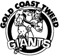
At Number TEN...

 The Gold Coast-Tweed Giants entered the NSWRL in 1988 alongside the Newcastle Knights and Brisbane Broncos and unveiled this beauty with a grey and white jersey that just screamed style.
 The concept of a big muscled football player doesn't sound incredibly iconic but it works in reality on a logo.
The mascot also could conceivably play Rugby League - which is always an issue when caricatures of different logos are attempted.
About the only question mark is why is the Giant sporting a crop top?
========================================
At Number NINE...


The old school Canterbury-Bankstown Bulldogs logo that carried the 'meanness' that their team played with for the 1980s and 1990s.
It was always a very tough logo to sketch out while not paying attention at school, and even tracing over a footy card was a difficult assignment.
The beauty of a logo like the Canterbury one was the detail in the Bulldog.
The colour mix of blue and white in a black circle just looks menacing like the Bulldog itself.
Slapped onto the iconic blue and white Canterbury jersey and the Dogs always looked ready to play.
========================================
At Number EIGHT...
 The Canberra Raiders and the logo that represented them were a force from the late 1980s all the way through the 1990s.
 Not an easy task when you consider that throughout that period the logo wasn't symmetrical.
The Canberra Raider within the lime green circle was drawn many times growing up by this writer, and it was always a challenge to get the shading right on the two horns and down one side of the helmet.
Then there was the shaded face issue - the eyes were the same but the moustache slightly different and the rest of the face all over the place.
But the logo worked despite this and was a symbol for a side that will be considered one of the greatest ever.
========================================

Growing up in the 1980s you learned very quickly that unless you supported Manly, you could not under any circumstance like them.
Although we still hold strongly to that belief but the Manly logo up until 1995 was a thing of beauty.
The 'spread eagle' in the maroon and white surrounds just said 'we're better than you' and every time your side would take on a team sporting that Manly logo - you'd fire up to prove otherwise.
The thin hoop jersey design was also a winner in either the white or maroon versions.
Going more '1990s cartoon like' was a mistake in the mid-1990s (although it wasn't until 1999 that the team began to really struggle on the field as a result)... and the current logo is trying to replicate the quality of the past but doesn't quite achieve it.
========================================
At Number SIX...


 The merger between the Illawarra Steelers and the St.George Dragons remains to this day a tragedy... because the 1999 joint venture meant that the Steelers 1998 version of their logo only saw the light of day for one season.
 While everyone is still unsure as to what the original 1982 'Steeler' was supposed to be, it still looked cool.
When the club was trying to stay relevant in the marketplace the new 1998 version was launched and it did a top job to capture the whole idea of what a 'Steeler' was in the region.

Just check out that logo on the left - that outer circle is chocolatey good.
The detail in the Panther is striking and the way it is pouncing across the circle and above the Panthers text is just a textbook logo win.
Truth be told the chocolate is more of a defining feature rather than a good looking one, but the way it works in the logo makes it a standout symbol for the Penrith football club.
========================================
At Number FOUR...
At Number FOUR...

 The St.George Dragons hold a special place in the history of Rugby League with their incredible eleven straight titles from 1956-1966, a feat that may never be matched.
Their logo during that streak is on the right but their logo from the late 1970s onward is a beautiful mix of vibrant red background, shadowed black knight and a meticulously detailed white dragon.
The shield suits the image and the block letters of ST.GEORGE looks at home atop the shield.
Although the club is now a joint-venture with Illawarra (since 1999), the logo's only alteration is the addition of ILLAWARRA snaking around the bottom point of the shield.
It is a classic looking logo that is deserving of 4th place in this list.
========================================
At Number THREE...

The Tiger has forever been a favourite amongst mascots around the world but the Tigers logo just showed (in great detail) why a Tiger should be feared.
Another one of those logos that were impossible to sketch free hand at school and not easy at all to trace.
The logo represented the warrior mindset of all the great players of that Tigers era - willing to scrap and claw their way to victory and sometimes just rip you apart.

Although a 'new logo' has been commissioned for their re-entry campaign it just cannot compare to the one they wore proudly on their chests in their Runs to the Preliminary Final of 1991, 1994 and 1996 (their trip to a PF in 1997 was with a terrible change in logo).
The Bears jersey may have changed during that time frame but it was when they switched to a terrible shield badge and changed the Bear graphic in 1997 - that things started to fall apart.
The Bears jersey may have changed during that time frame but it was when they switched to a terrible shield badge and changed the Bear graphic in 1997 - that things started to fall apart.
That last line is not meant to be taken seriously, but the original (in our mind anyway) Bear on the white background and black circle is an outstanding design.

The Brisbane Broncos made an instant statement that they would be a force to be reckoned with in the Premiership, by smashing the defending premiers from 1987 Manly-Warringah 44-12 in Round 1 of 1988.
But their debut was notable for the unveiling of the best logo in Rugby League history on the football field.
The name Broncos was a little bit Americanised but the logo that was created for the Brisbane team just looked fantastic and immediately captured the idea of a horse running free through Queensland.
The name Broncos was a little bit Americanised but the logo that was created for the Brisbane team just looked fantastic and immediately captured the idea of a horse running free through Queensland.
Since 2000 when the Broncos adopted the Chess piece as their logo - the Broncos jerseys have been poorer for it.
But the thing of beauty that was Brisbane's bucking Bronco from 1988 is simply the best logo Rugby League has ever seen.
But the thing of beauty that was Brisbane's bucking Bronco from 1988 is simply the best logo Rugby League has ever seen.
===
DO YOU AGREE WITH THE BRISBANE BRONCOS AT NUMBER ONE?
|=| |=| |=|
Honourable Mention #1...
DO YOU AGREE WITH THE BRISBANE BRONCOS AT NUMBER ONE?
|=| |=| |=|
Honourable Mention #1...

The Cronulla-Sutherland Sharks had a haunting logo for almost 20 years before changing foolishly to a Shark in a Star debacle in 1995.
The logo that carried the club through the parts of the 1970s, 90s and all of the 1980s was a defining image of the club.
With the blue, black and white colour scheme on the jersey - the Sharks looked scary once their players perspiration saturated the jumpers and although a premiership has eluded them, they had a fine logo for a long long time.
========================================
Honourable Mention #2...
 The Western Suburbs Magpies were never a 'sexy' club and despite a surge towards the top of the league in the early 1990s under Warren Ryan and his Canterbury contingent, they eventually fell into obscurity and mediocrity and into a merger with the Balmain Tigers by 2000.
 Their logo for the period of the 1980s and 1990s was remarkably simple but so strong. The Magpie has forever been an annoying bird in everyone's lives and under Ryan the Magpies annoyed a lot of teams on their way to Finals Series appearances in 1991 and 1992.
The Magpie still has a home on the shoulders of the Wests Tigers jersey but the days of the Black Jersey with the double White V (or the reverse White Jersey with double Black V) are fondly remembered.
========================================
OTHERS WORTHY OF RECOGNITION...
OTHERS WORTHY OF RECOGNITION...
ROOSTERS KNIGHTS
KNIGHTS
 RABBITOHS
 EELS
EELS========================================
WHAT IS YOUR CHOICE AS THE BEST LOGO IN RUGBY LEAGUE HISTORY?